SentinelOne
Web design, rebranding and creative direction for the multi-billion-dollar cloud security giant.

// Project Goals
We took on the massive challenge of a top-to-bottom design transformation for SentinelOne, a multi-billion-dollar cloud security leader. The goal wasn’t just a facelift; it was a complete overhaul of their brand presence to match the sophistication of their solutions. We handled everything—brand identity, typography, a total website revamp, video ads, illustrations, and even print and POS displays.
The core challenge was taking highly complex, cutting-edge cloud security concepts and presenting them in an accessible, visually engaging, and cohesive way across every single touchpoint, ensuring the brand resonated powerfully with a highly sophisticated audience.
// The Result
The results of this strategic redesign were immediate and measurable across the 28 delivered tasks. The fresh, intuitive design strategy directly fueled a 12.2% growth in revenue by drastically enhancing user engagement and the effectiveness of marketing campaigns. Even better, by optimizing marketing spend and maximizing creative output, the redesign generated a massive 38.1% reduction in costs. Backed by insights from four successful A/B tests, we also saw a 25.5% spike in user growth. Ultimately, the new design system didn't just look better—it proved the tangible, bottom-line value of cohesive creative direction, cementing SentinelOne’s position as a market leader.
+25.5%
User activation rate
+12.2%
Monthly active users
19%+
Transaction completed
4.8/5
Customer satisfaction




Making Complex Technology Feel Clear
SentinelOne operates in a category where the product is powerful, technical and difficult to explain quickly. The challenge was not simply to make the brand look better, but to make sophisticated cloud security feel understandable, credible and visually compelling without simplifying it to the point where it lost meaning.
I worked across web design, branding and creative direction to create a clearer visual language for the company and its technology.
The aim was to help people understand the value faster, while making sure the experience still felt appropriate for an enterprise security brand competing at the highest level.
Creating One Brand Across Many Touchpoints
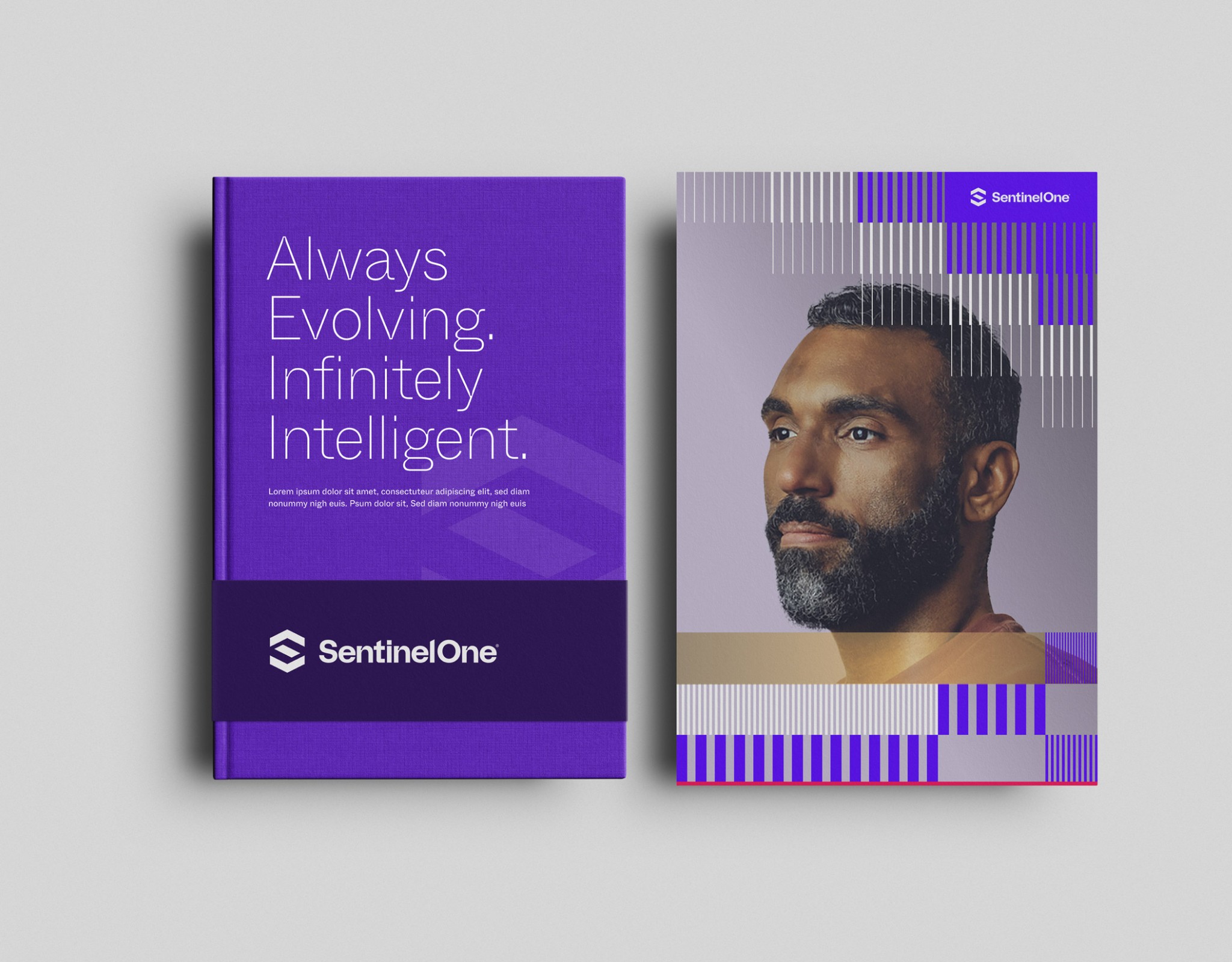
The work quickly expanded beyond a website redesign. SentinelOne needed a more cohesive presence across digital, campaign and physical channels, so I worked across typography, visual identity, illustrations, photography, web experiences, social content, video advertising, marketing assets, print and point-of-sale materials.
The important part was not making every piece look identical. It was creating a recognizable system that could adapt to very different formats without losing its character. Whether someone encountered the brand through a landing page, an ad, a presentation or a physical display, the experience needed to feel like it came from the same company with the same level of confidence.
Designing for Attention Without Losing Substance
Cybersecurity marketing can easily become either too technical or too generic. One extreme overwhelms people with information; the other says almost nothing. The design strategy was built around finding the useful middle ground.
Complex ideas were given stronger hierarchy, sharper messaging and more visual structure, while campaigns were designed to earn attention before asking people to understand the details. The goal was to make the brand easier to enter without making it shallow.
Good design, in this case, was not decoration. It was a way of deciding what people needed to notice first, what they needed to understand next and what could wait until they were ready to go deeper.
Building a Creative System, Not a Collection of Assets
Across 28 delivered tasks, the real value came from treating the work as one connected design system rather than a series of isolated requests. My team of eight designers and I created a framework that allowed new web pages, campaigns, ads and brand materials to feel consistent while still leaving enough room for each piece to do its job.
That made the creative process faster and helped reduce the amount of reinvention needed from one campaign to the next. It also gave the brand a stronger point of view: one that could support highly technical product communication, large marketing campaigns and everyday commercial needs without constantly changing visual direction.
When Design Starts Affecting the Business
The impact was measurable. Across the delivered work, the redesign contributed to a great success metrics improvements (see the numbers on the top of this article), supported by insights from four successful A/B tests. Those numbers mattered because they showed that a more coherent design strategy was doing more than improving presentation. It was helping campaigns perform better, making marketing spend more efficient and strengthening the way the company communicated its value.
The lesson was simple: when design makes a complex company easier to understand and easier to trust, it stops being a layer on top of the business and starts becoming part of how the business grows.

