Clover Virtual Terminal
Expanding Clover’s Web Dashboard with seamless wallet and prepaid card features — transforming business users into empowered financial operators.

// Project Goals
We stepped in to rethink Clover’s Virtual Terminal. It’s widely known for physical point-of-sale devices, but merchants needed more than just a place to enter credit cards manually. The goal was to transform the web dashboard into a true financial command center, integrating a white-label digital wallet directly into the interface.
We needed to build a system where business owners could easily manage deposits, withdrawals, prepaid cards, and complex transaction histories, all without feeling like they were lost inside a clunky, traditional banking portal.
// The Result
By creating a modular, responsive wallet system with a clean visual hierarchy, the new interface proved that the Clover Web Dashboard can be a powerful wallet alternative, rather than just a basic virtual POS. The data backed this up: we saw a massive 64% increase in wallet feature usage, alongside a 32% bump in task success rate. Merchants responded with overwhelmingly positive feedback, highlighting how the clarity, transparency, and feature richness gave them complete control over their business finances in an environment they already trusted.
+64%
User activation rate
+14.2%
Monthly active users
+7.6%
Transaction completed
94.6%
Customer satisfaction







From Virtual Terminal to Financial Command Center
Clover is widely known for its physical point-of-sale devices, but many merchants increasingly manage their businesses away from the counter.
The Virtual Terminal already gave them a web-based way to process payments, but there was an opportunity to make it much more useful. We redesigned the financial side of the dashboard around a broader idea: instead of being simply a place to enter card payments, it could become a financial command center for the business.
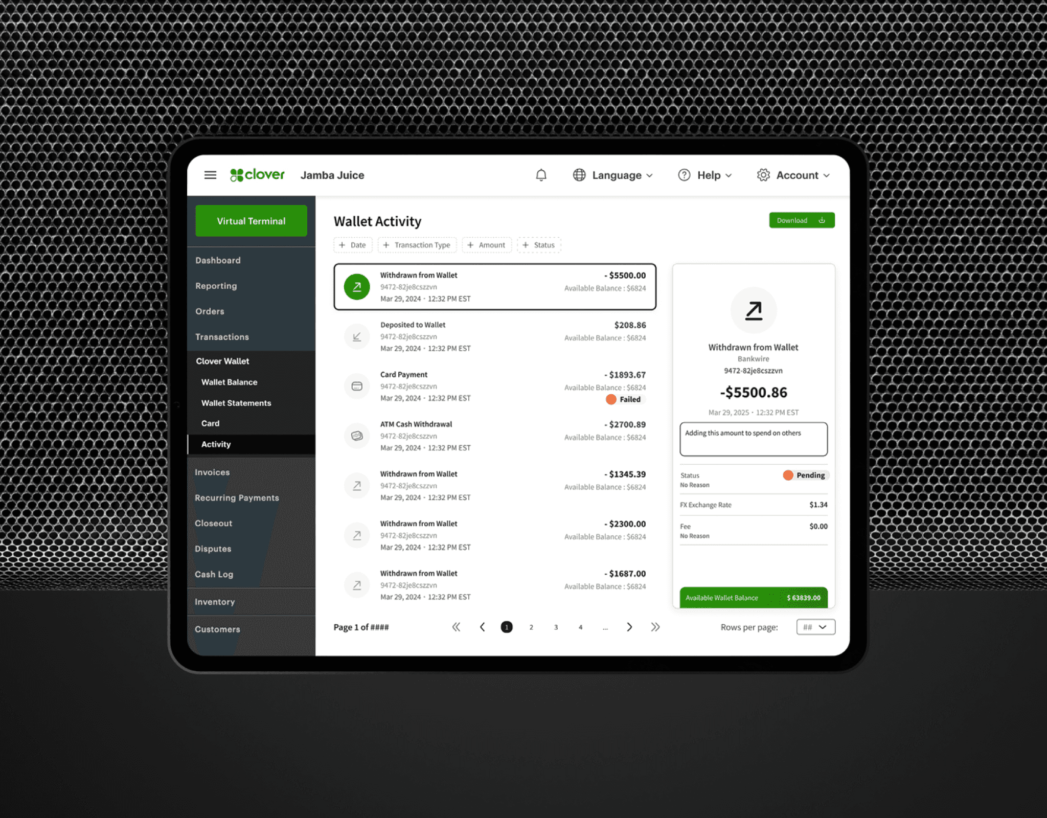
The experience brought wallet balances, deposits, withdrawals, prepaid cards and transaction activity into one familiar environment, giving merchants a clearer picture of how money was moving through their business without forcing them into a separate banking-style product.
Making Powerful Financial Tools Feel Simple
Adding wallet functionality sounds straightforward until it meets the reality of business finance. Merchants needed access to different balances, funding methods, ACH transfers, card activity, transaction histories and payout information, often while trying to answer very simple questions:
How much money do I have?
Where did this payment come from?
When can I access these funds?
The challenge was to expose that depth without making the dashboard feel intimidating. We reorganized information around the decisions merchants actually needed to make, using clearer hierarchy, more visible balances and predictable flows for deposits and withdrawals. The objective was not to remove functionality, but to make a powerful financial system feel much lighter to operate.
Designing a Modular Wallet Inside an Existing Product
Rather than introducing a completely separate wallet experience, we designed the new functionality to live naturally inside Clover’s existing web dashboard. The system was built around reusable modules for balances, cards, transaction activity and money movement, allowing the experience to grow without requiring the interface to be redesigned every time a new capability was introduced.
Deposits and withdrawals were streamlined, wallet activity could be filtered and exported, transaction history brought together methods such as ACH, cards and QR payments, and prepaid card management included actions such as PIN viewing, freezing, unfreezing and replacement. A consistent set of design patterns and tokens helped the new financial layer feel like part of Clover rather than a product sitting next to it.
Designing for Merchants, Not Bankers
The most important design decision was to remember who the product was for. A restaurant owner, retailer or service business should not need to understand banking terminology or financial infrastructure to manage everyday cash flow. The interface therefore prioritized recognition over interpretation: clear balances instead of abstract account structures, understandable transaction states instead of technical processing language, and important actions placed where merchants naturally expected to find them.
Responsive layouts were optimized for the desktop environments where many businesses manage their operations, while the information architecture remained flexible enough to support more complex financial needs.
The result was an experience that gave sophisticated users more control without making first-time users feel that they had suddenly entered a banking portal.
Expanding What Clover Could Be
The redesigned experience showed that Clover’s web platform could play a much larger role in a merchant’s financial life. Wallet feature usage increased significantly, task completion improved, and merchant feedback highlighted the clarity and control provided by having richer financial functionality inside a product they already knew and trusted.
The broader product delivered a significant performance increase (see the numbers in the beginning of this article). In addiiton, the project demonstrated a larger product opportunity: when payments, balances, cards and money movement become part of one coherent experience, a Virtual Terminal stops being simply a tool for accepting money and starts becoming the place where merchants understand and manage it.

