Chelsea FC Wallet
Integrating wallet and debit card features into Chelsea’s app, turning fans into financially empowered members.

// Project Goals
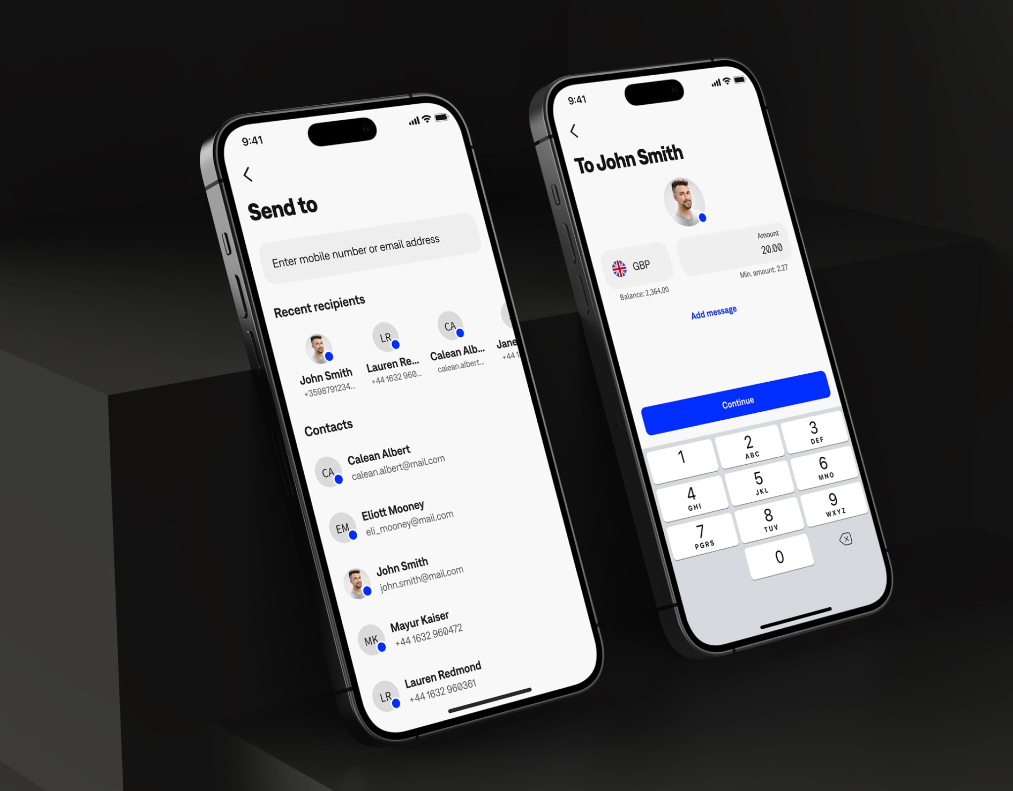
We set out to turn football fans into financially empowered club members. For Chelsea FC, this meant taking their existing iOS app and injecting a full-scale, white-label digital wallet right into its core. We didn’t just want a place to hold money; the goal was to create a seamless financial ecosystem where deposits, P2P transfers, and prepaid cards felt natural alongside match tickets and merch.
The ultimate challenge was bridging cold, complex fintech infrastructure—like KYC onboarding and payouts—with the emotional, passionate world of sports fandom, building a wallet that didn’t feel like a bank, but rather an extension of the club they love.
// The Result
The concept hit exactly the right nerve. When we put the prototype in front of Chelsea fans, we saw a massive 88.5% positive feedback rate during testing. Because we gamified the experience with loyalty dashboards, trivia, and collectible badges, fans didn't just use the wallet; they engaged with the club more deeply, driving a 32% increase in merchandise sales and loyalty feature interaction compared to the baseline app. Fans ultimately called it "the ultimate way to connect with the club digitally," proving that when you merge solid financial tools with high-emotion fan culture, you create a scalable model for the future of sports apps.
+32.1%
User activation rate
+12.4%
Monthly active users
+32%
Transaction completed
88.5%
Customer satisfaction




Turning a Concept Into a Working Product
The Chelsea FC Wallet started with a simple but ambitious idea: integrate a full financial experience directly into the club’s existing app, allowing fans to manage money, receive payouts, use a prepaid card and engage with Chelsea through the same product.
The challenge was to make financial functionality feel completely natural inside a sports experience rather than like a separate banking product bolted onto it. I approached the project not only as a UX and visual design exercise, but as a product that needed to behave like real software.
That meant defining the flows, interaction logic, component behavior, edge cases and responsive states in enough detail that the experience could move beyond static screens and become a functional prototype that people could genuinely interact with.
Bridging Design and Implementation
A major focus of the project was reducing the traditional gap between design and development. Instead of treating Figma as the final destination, I used the design system and interaction model as the foundation for a working interface.
Core patterns such as the wallet dashboard, transactions, cards, loyalty features and account actions were designed as reusable components with clear states and behavior rather than one-off layouts. The goal was to think about every screen in terms of how it would actually be built, reused and maintained. This changed the design process itself: decisions around spacing, hierarchy, typography, navigation and component structure were made with implementation in mind from the beginning, creating a much tighter relationship between the visual system and the final product experience.
Designing a Loyalty System Around Fan Engagement
The loyalty layer was one of the most important parts of the concept because it connected the financial product to the emotional reason users already had for engaging with Chelsea.
I designed a system around points, badges, rewards, challenges and club-related achievements, giving fans reasons to return beyond purely transactional wallet activity. The idea was to reward meaningful behaviors such as using the wallet, completing selected actions and engaging with Chelsea-related content, then translate that activity into visible progress and unlockable benefits.
Rather than treating loyalty as a separate rewards page, I designed it as part of the broader product loop, where spending, engagement and progression reinforced each other.
The challenge was to make the system motivating without turning the product into a game, keeping the visual language premium and the rewards understandable enough that users could immediately see what they had earned, what they could unlock next and why it mattered.
Prototyping Real Behavior, Not Just Screens
The most important part of the project was making the experience feel operational. Key journeys were built as connected, interactive flows rather than static presentation screens, allowing users to move through onboarding, wallet management, payments, card interactions and loyalty experiences in a realistic way.
Designing at this level exposed problems that are easy to miss in traditional mockups, including transition states, empty states, loading behavior, confirmation patterns and what happens when a user moves between financial and club-related features.
Working with a functional prototype also made it possible to evaluate the product as a complete experience instead of asking users to imagine how separate screens might eventually work together.
Proving the Product Through Use
Once the experience was interactive, it could be tested as something much closer to a real product. More importantly, the project demonstrated the value of treating design as something that can move directly toward implementation rather than ending at handoff.
The strongest lesson was that building changes the quality of the design itself: when interactions, components and flows have to actually work together, decisions become more precise, inconsistencies become visible earlier and the final experience becomes easier to evaluate.
For me, Chelsea FC Wallet became an example of product design that does not stop at describing how a product should work, but pushes far enough to prove how it can actually behave.

